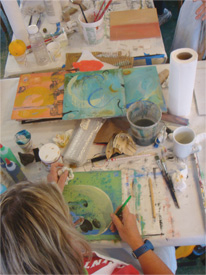
I just started working on a diptych and have already put down a bunch of marks. While I’m pleased with what I have so far, the piece isn’t particularly harmonious – some colors and shapes are much more noticeable than others, and the overall effect is a bit disorienting.
Watch the video and discover how I solved this problem. Once you have, let me know how you adjust the compositions of your pieces – I would love to hear!
In gratitude, Nicholas