 Why do some colors look better than others? When purchasing paint at the art store, I used to think that the more expensive colors were somehow better. I reasoned that if I used these colors in my paintings they would magically look great. Unfortunately, over time, I realized that making great color was not so simple.
It turns out color only looks good (or bad) because of its relationship with the existing colors around them. In other words, it is relative. Color can look breathtakingly gorgeous but usually because it is surrounded by or next to a second color that is simply different.
To help me quickly choose a color that will look good next to an existing color, especially when I get stuck, I ask myself three questions. This sequence of basic questions is one I teach in my ArtLife workshops, and has often helped me come up with a color choice that totally works. The three are listed below in order of relative strength. In other words, the first question creates the biggest visual difference, followed by the second and lastly, the third.
#1 Is my new color going to be dark or light?
First question. Always. The easiest, most dramatic, powerful way a color can be different from another is to be different in terms of Value (the lightness or darkness of a color). It is kind of odd to think of color in a black and white way, but if you can get in this habit it will actually make your work visually change faster and more efficiently. So for example if there is an existing patch of cadmium light yellow, possibly a dark value color will be a nice complement. Interestingly, if you get the values to contrast between two colors side by side, almost any color choice will work.
#2 Is my new color going to be dull or bright?
This is saturation. How much yellow is in that yellow? Basically remembering that the most saturated color is from the tube when you buy the paint. Lots of yellow color in yellow makes it saturated. When a paint color is filled with other colors, or when white or black are used to make this color, it will be less saturated, less bright and duller. So that existing patch of pale yellow light is quite washed out, it is made with lots of white so most likely the dark value color we are going to add could be quite saturated.
#3 Is my new color going to be warm or cool?
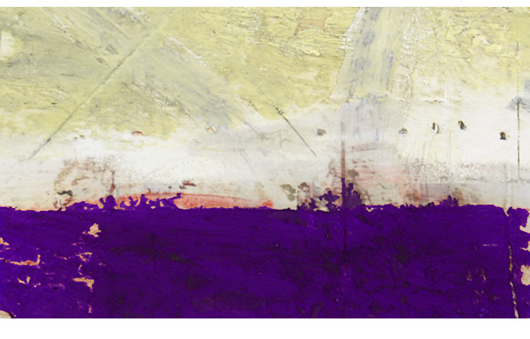
Temperature of color is also relative. The colors – if we imagine a color wheel – that are directly across from one another in the wheel are most unlike each other. Red is most different from green and yellow is most different from purple. Partly the reason why is because of their temperature. Red is warm and green is cool. Reds, yellows and oranges are warmer than greens, blues and purples. This aspect of color – temperature – is a nice one to keep in mind when looking to juxtapose one color with another. So our existing patch of pale yellow light that is dull or washed out would look good or would be complemented well with a #1 dark, #2 saturated, #3 cool color. A dark royal blue, a deep purple or even a bright dark green will all be visually potent neighbors next to our existing patch of cadmium yellow light.
When I am adjusting a painting I am often looking at my color choices to see that they contrast with one another in these three ways. When they do, I know that I am getting the most visual bang for my buck that I can. Or at least I am getting close.
There are no rules in art. However, having a few principles or guidelines or at least understanding visually why sometimes color is working or not has been helpful to me, especially when I feel I am just reworking an area without actually changing it.
One of my favorite parts of making art is playing with color. I hope this series of 3 questions helps you or better yet, maybe you have some other ways of thinking about color that could be helpful to the rest of us.
Please share it here if you do.
With gratitude, Nicholas